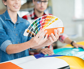
In the last few years, the print world has become vibrant by embracing several color trends, including the bold neon. But in this spectrum of colors and with the strategic use of brighter than bright colors across various platforms, remaining muted can be a welcome relief for the human eye and create a nice, relaxed feel for the clients you are trying to attract. Sydney Graphic Designers in NSW have been instrumental in this for quite some time. However, 2021, is showing another way altogether.
The latest color trend dominating 2021 and maybe beyond
In this world of multiple loud colors, 2021 is going old school and choosing to be colorless. The world has gotten very fast, ultra-sensational, and in-your-face in the last few years. In such a situation, a small business or start-up thinking about competing with the more prominent names in the market should think strategically. Many of your competitors are most likely using many colors as part of their marketing strategy including their website or logo. This practice is often a distraction that takes away from your communication and key messages. It can be better to go the other way and design something that is muted and colorless. 2020 was already moving towards a muted palette, and 2021 has taken things up a few notches to the simple look and style of black and white.
The stark difference is what is catching people’s attention
Amongst the riot of color, creations in black and white can come across as soft and subtle but can be extremely enticing If you have not thought about this look for your business, then you should start now. Doing something different has always been a sure-fire way of catching the attention of others, and sometimes the color-less palate can be just as effective and beautiful as using vibrant colors. Many people have a concern that after remaining at home and fighting a pandemic, customers may not like this black and white approach, but that is not true.
Something subtle and peaceful has always resonated better
There is an ever-increasing number of Marketers, graphic designers, and even customers that are looking for something subtle and peaceful, which is possible with this use of a simple black and white color structure. The magical and almost hypnotic charm of an old black and white movie is still there and is influencing other areas of creation. Yes, a graphic designer is trained to work with colors and their different shades. It may seem like asking them to work with the color-less trend is not going to be easy. They may seem offended or think that their skills are not getting utilized fully That is not true, because the idyllic nature of this color-less trend is starting to influence the designers too.
The industry is experiencing a revolution
A competent and experienced graphic designer will tell you that working with an extended color palette is exciting, but getting to work with a black and white is similarly intriguing, if not more. People tend to think that the absence of color will make the design monotonous and dull, but the opposite is true. After watching the computer screen for hours, a muted, almost liquid-like shapes, shadows, simple animation make any design stand out, especially if it is not full of bright and bold colors. The use of a color-less palate can provide the opportunity and texture that is not possible by any other option. This new trend is revolutionizing the industry.
If you are looking for a reliable graphic design and printing company, let Inform Print be the right choice. With the best technology and resources in place, you can be assured to get the best quality of work delivered each and every time.